It turns out that, without millions of dollars, it’s not easy to create the same level of features that people have come to expect from Facebook, Twitter, Telegram and other Big Tech platforms. But over the years, we persevered. That’s how Qbix Platform has come to have more features than any other open source social platform, including even Matrix and Mastodon, and now they can be used as building blocks by anybody.
We started development on what would become the Qbix Platform in 2012. (Actually, the roots go a few years before that, to a framework called PHP on Pie).
The first few years, we had to make the features in the first place. Then, for a few years we went through the “trough of sorrow” where paying clients complained about very legitimate bugs, such as real-time chat not coming out the other side! These were some of the most demoralizing times, as we felt we were failing our initial paying customers, and in fact ended up disappointing a couple of them, despite our best efforts. It is one of the reasons we now advocate to treat your first customers as investors, and give them the option to pay for the product by buying shares in your company.
But we pushed through it, and eventually we got to a point where almost none of the complaints were of a technological nature. The years 2018-2022 were dominated mostly by comments like “it doesn’t look good enough”, or “your app looks like the 90s.”
Nevermind the fact that apps of this kind weren’t actually around in the 90s, and the early social networks looked a lot crapper. And nevermind that the current social platforms are overrun with ads, toxic content, make people depressed and present dangers to our democracy. People were used to using them — or rather, a tiny subset of them — so they appeared like “the thing to look like”. If you want most people to switch from eating meat to being vegetarians, it’s not enough to appeal to their idealistic side — your burgers have to feel and taste like the meat they’re used to ![]()
It’s harder than it looks
You might think that we can just hire some designers and make it look awesome. The thing is, we’ve tried. We’ve dome about 10 different redesigns of Qbix and Intercoin sites, and we even copied verbatim the interface of platforms like Facebook Messenger on mobile.
It turns out that, when you’re building an operating system, you have to strike compromises and trade-offs across a wide variety of areas. Apps built on your platform have to work across every mainstream device — whether the form factor is mobile, desktop, tablet; whether the user has a mouse, a touch interface, or both. Tabs may run out of space. User-generated content may spill out of a container. Translating the interface to other languages may result in longer labels than can fit on a button. And so on.
Combining elements
When combining rules, colors are often a major sticking point — you make text black across a site, and then it shows up in one place on a black background. Or vice versa. What to do?
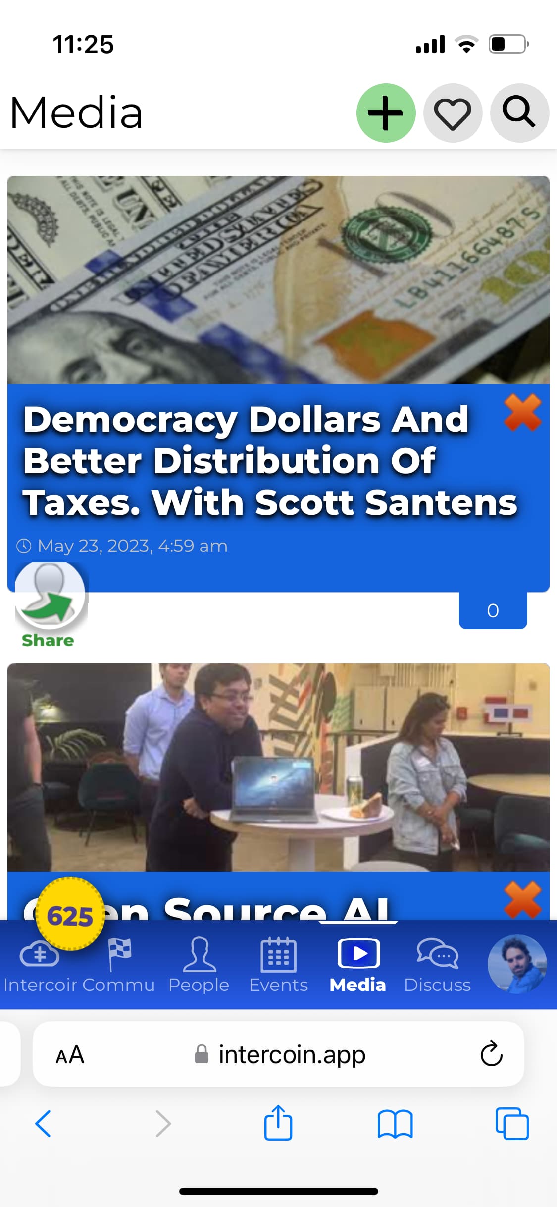
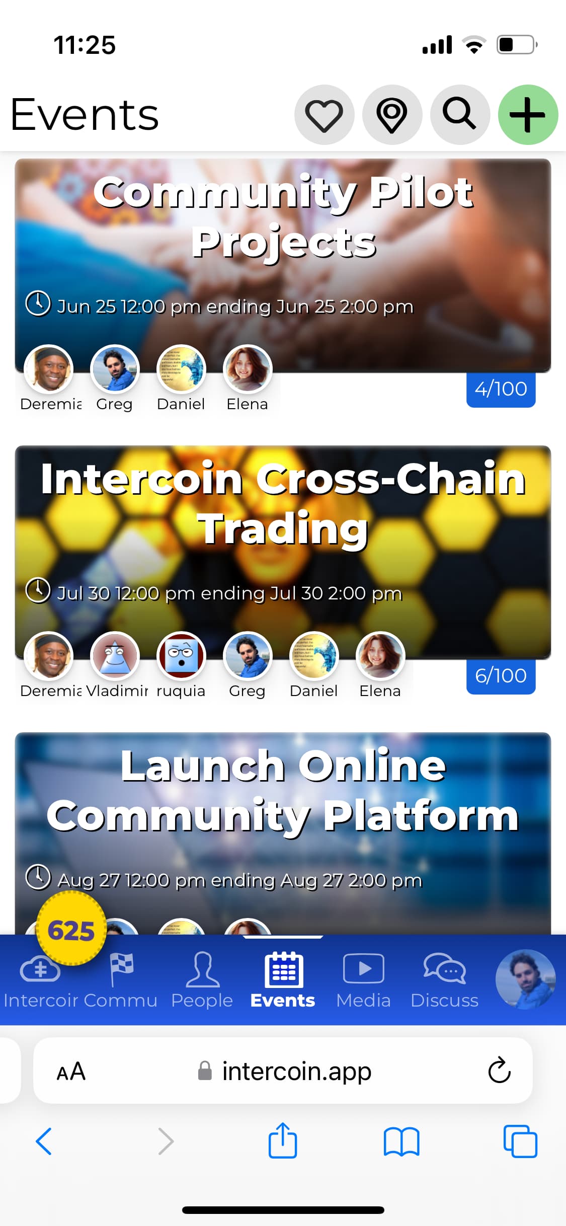
Take, for example, a site that one of our new clients shared with us. The current site has issues displaying a text title over a photo. Why? Because the photo can theoretically contain arbitrary content, and the text can be hard to read over it.
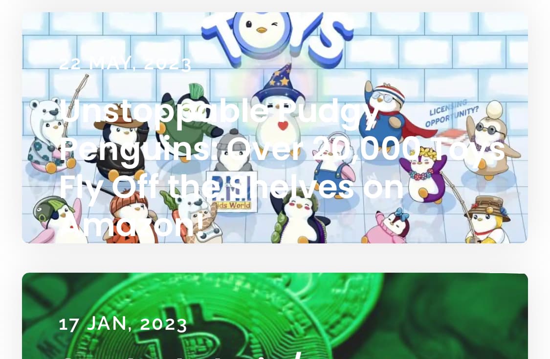
Many sites apps address this by either darkening the picture (like Groupon used to do), or blurring it behind the text. The text is typically white.
Just in case, you may want to add a dark text-shadow underneath it. Having a black outline tends to help draw the eye to perceive clean edges — like in most DC comics vs Marvel comics — but that works more with fat images or big fat text. For thinner text, a subtle shadow would help.
The other approach is to simply place the text underneath. Here are the two approaches as we use them on intercoin.app/events and intercoin.app/shows:
And that is what I told our client:
Custom Themes
As a designer for Qbix, you have several layers of styling to work with, for your theme CSS file. The most “bang for the buck” is changing the CSS variables exposed by different plugins — this helps you change colors, fonts, etc. across the entire project in a way that preserves consistency.
After that, for more granular control, you can start changing the fonts and colors, styles and behaviors of individual tools, such as a chatroom. Qbix has spent years trying to build sensible defaults that work well when you combine things. So be careful messing with those.
But ultimately, if you end up coming up with a good theme, you can re-sell it to clients around the world, tweak it, and more. Work with other Qbix ecosystem participants like translators, moderators etc. to create a beautiful community experience for your clients, in your own countries and languages. Enjoy!